Design System Preview
Premium interface foundations
A temporary development route for checking tokens, typography, components, glass surfaces, media frames, spacing, and grid behavior before building the final pages.
Ink
#09090B
Surface
#111114
Surface 2
#18181C
Purple
#7C4DFF
Accent
#A970FF
Blue
#5BCBFF
White
#F8F8F8
Gray
#AFAFAF
Typography
Large, quiet, confident type
The scale reserves hero-sized typography for cinematic moments and keeps compact surfaces readable.
Display 2XL
Build products people remember.
Heading XL
For section-level statements with room to breathe.
Heading LG
For product cards, case intros, and feature blocks.
Heading MD
For compact panels, cards, and control surfaces.
Buttons
States and variants
Glass Cards
Depth without visual noise
Glass surfaces use consistent blur, border, radius, and hover behavior.
default
A reusable glass surface for sections, cards, controls, and product context.
strong
A reusable glass surface for sections, cards, controls, and product context.
muted
A reusable glass surface for sections, cards, controls, and product context.
interactive
A reusable glass surface for sections, cards, controls, and product context.
Media Frames
Real assets inside stable frames
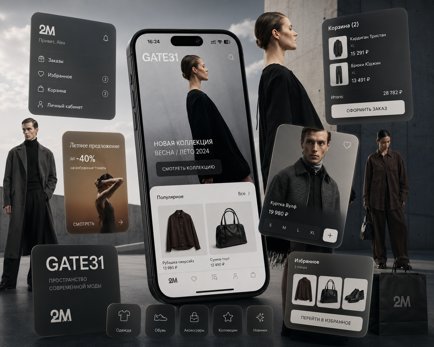


Project Artwork
Key visuals without synthetic wrappers

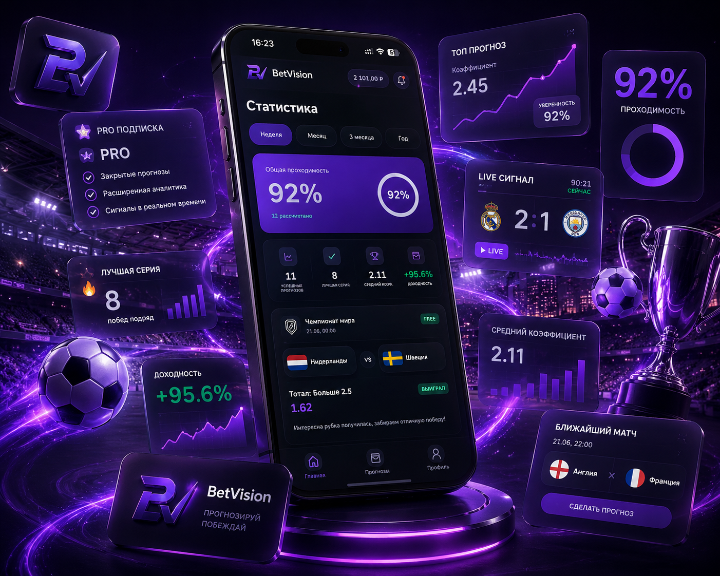

Grid
Responsive containers and section rhythm
The system uses a 1440px outer container, 1280px content width, and responsive padding.
Spacing